

Responsibilities: Visual Design - 2021
Improved design consistency and speed of implementation by building a reusable UI component library aligned with a modern brand identity.
The challenge
Oodle was undergoing a brand refresh and needed a scalable visual system that ensured consistency across its web app. The design team needed to speed up development, reduce inconsistencies, and support future growth—all while capturing the new playful tone of the brand.
I led visual design by creating reusable UI components, defining a scalable visual language, and ensuring alignment with Oodle’s refreshed brand. I collaborated with product managers and engineers to ensure smooth implementation and documentation.
My role
Project Scoping
The project began with a scoping session alongside with the client. Why the redesign was needed and what the deliverables is. Then we began with a detailed review of the existing product UI, working with stakeholders to identify which pages required redesign and why. This ensured we focused on high-impact areas while aligning with engineering and brand goals.
1/6
Exploration
To define the new tone, we set a collaborative mood board session that helped lock in visual direction. This step built team consensus around Oodle’s updated personality—fun, clean, and user-friendly.
2/6
Setting Up the Visual Language
To define the new tone, we set a collaborative mood board session that helped lock in visual direction. This step built team consensus around Oodle’s updated personality—fun, clean, and user-friendly.
3/6
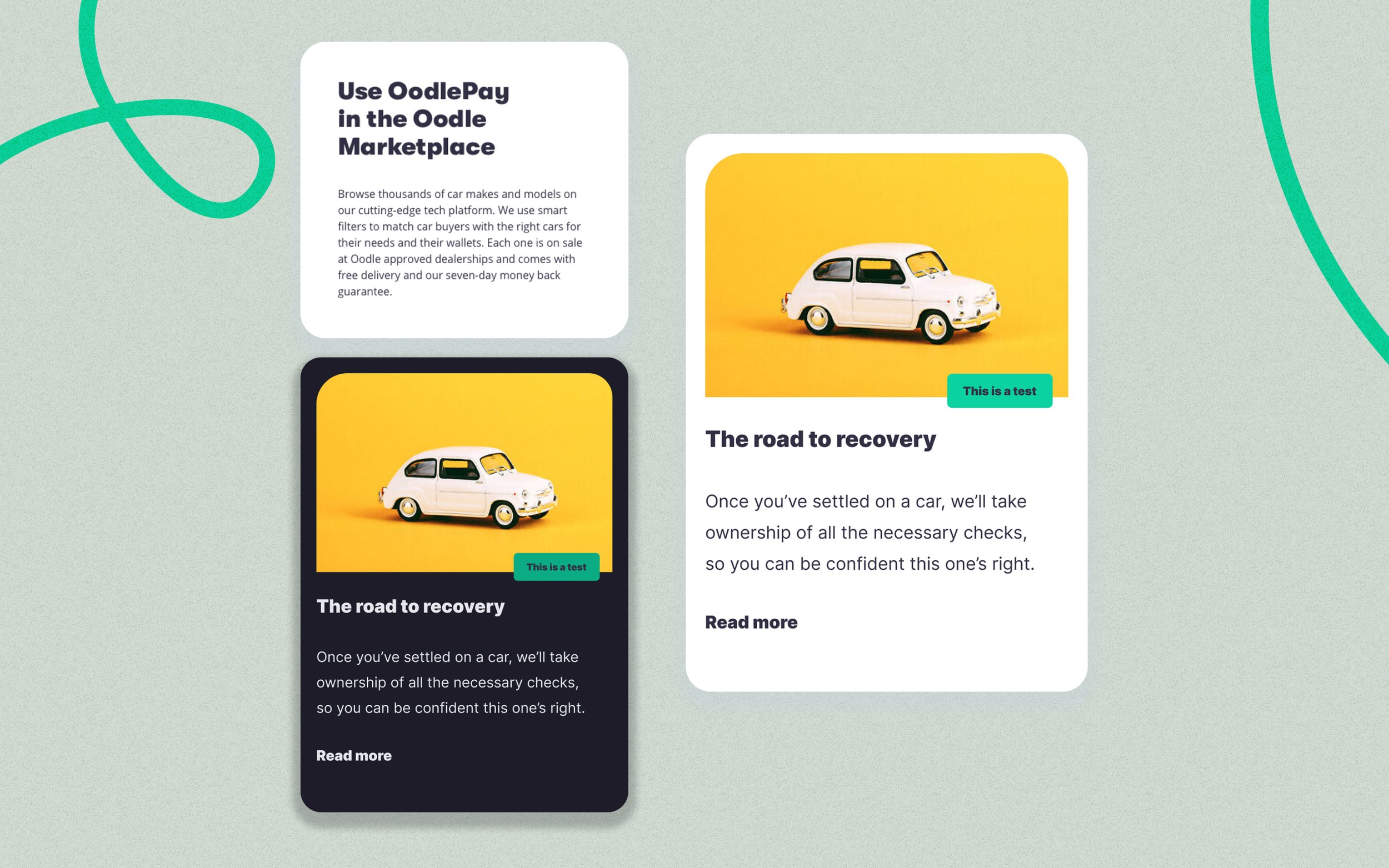
Component Exploration & Finalisation
Led the creation of reusable UI templates for high-impact pages (e.g., homepage, article, dashboard). I focused initial exploration on core components—primarily cards, which formed the basis of most UI structures. I iterated through multiple layout versions and validated them through feedback loops. Once finalized, I expanded the system to include heroes, menus, and content blocks.
4/6
Documentation & Templates
Each component came with usage guidelines covering spacing, states, and responsiveness. I also created reusable templates (e.g., article and homepage) to standardise layout while preserving flexibility.
5/6
Results & Impact
Delivered a scalable component that improved UI speed & dev handoff
Reduction in design duplication by introducing scalable and responsive components
Faster dev handoff through clear, documented specs and page templates
Improved brand consistency across key user journeys in the web app
6/6
Challenges
Prismic’s system often required components to be more rigid than what sketch allowed. I had to design reusable components that balanced brand expressiveness with the limitations of Prismic’s templating structure.